CREATIVE DIRECTION
BRAND IDENTITY
VIDEOGRAPHY
PHOTOGRAPHY
WEB DESIGN


(01)
SAVANO is a ready-to-drink cocktail brand created for Olivia Attwood. Inspired by the effortless glamour and hedonism of Riviera beach clubs in the 1970s and 80s, the identity balances nostalgic influences with a contemporary FEEL. Rather than relying on overtly retro references, the aim was to capture the spirit of the era through timeless design cues, creating a brand that feels both familiar and enduring.
SAVANO is a ready-to-drink cocktail brand created for Olivia Attwood. Inspired by the effortless glamour and hedonism of Riviera beach clubs in the 1970s and 80s, the identity balances nostalgic influences with a contemporary FEEL. Rather than relying on overtly retro references, the aim was to capture the spirit of the era through timeless design cues, creating a brand that feels both familiar and enduring.
(02)

(03)


(04)
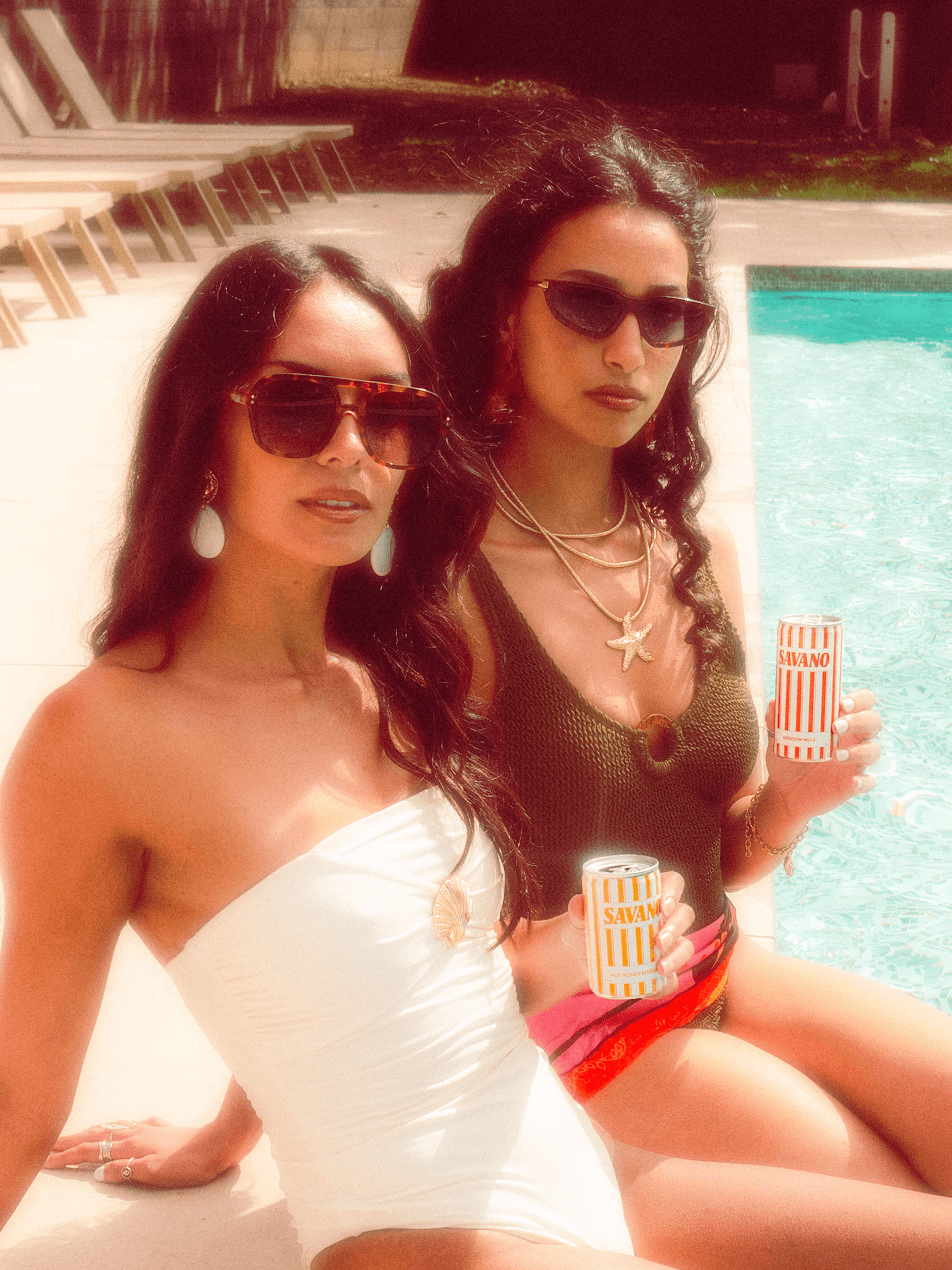
The visual style of the imagery and digital assets was developed to reinforce the brand's 1970s and 80s-inspired aesthetic. the direction draws on its sense of freedom, confidence and carefree escapism, qualities that sit at the heart of the Savano brand. Digital assets were designed to echo the layouts and typography of vintage fashion editorials, creating a nostalgic visual language.
The visual style of the imagery and digital assets was developed to reinforce the brand’s 1970s and 80s-inspired aesthetic. the direction draws on its sense of freedom, confidence and carefree escapism, qualities that sit at the heart of the Savano brand. Digital assets were designed to echo the layouts and typography of vintage fashion editorials, creating a nostalgic visual language.
(05)


SAVANO MONOGRAM (06)
#3B2B22
RGB: 59,43,34
CMYK: 56,67,71,66
#F8D2A4
RGB: 248,210,164
CMYK: 2,18,37,0
#FFF4E3
RGB: 255,244,227
CMYK: 0,4,10,0
#FCB237
RGB: 252,178,55
Pantone: 1235 C
CMYK: 0,33,88,0
#D1373A
RGB: 209,55,58
Pantone: 711 C
CMYK: 12,93,82,3
#4C7D71
RGB: 76,125,113
Pantone: 625 C
CMYK: 71,32,55,16
COLOUR PALETTE (07)
#3B2B22
RGB: 59,43,34
CMYK: 56,67,71,66
#F8D2A4
RGB: 248,210,164
CMYK: 2,18,37,0
#FFF4E3
RGB: 255,244,227
CMYK: 0,4,10,0
#FCB237
RGB: 252,178,55
Pantone: 1235 C
CMYK: 0,33,88,0
#D1373A
RGB: 209,55,58
Pantone: 711 C
CMYK: 12,93,82,3
#4C7D71
RGB: 76,125,113
Pantone: 625 C
CMYK: 71,32,55,16
COLOUR PALETTE (07)
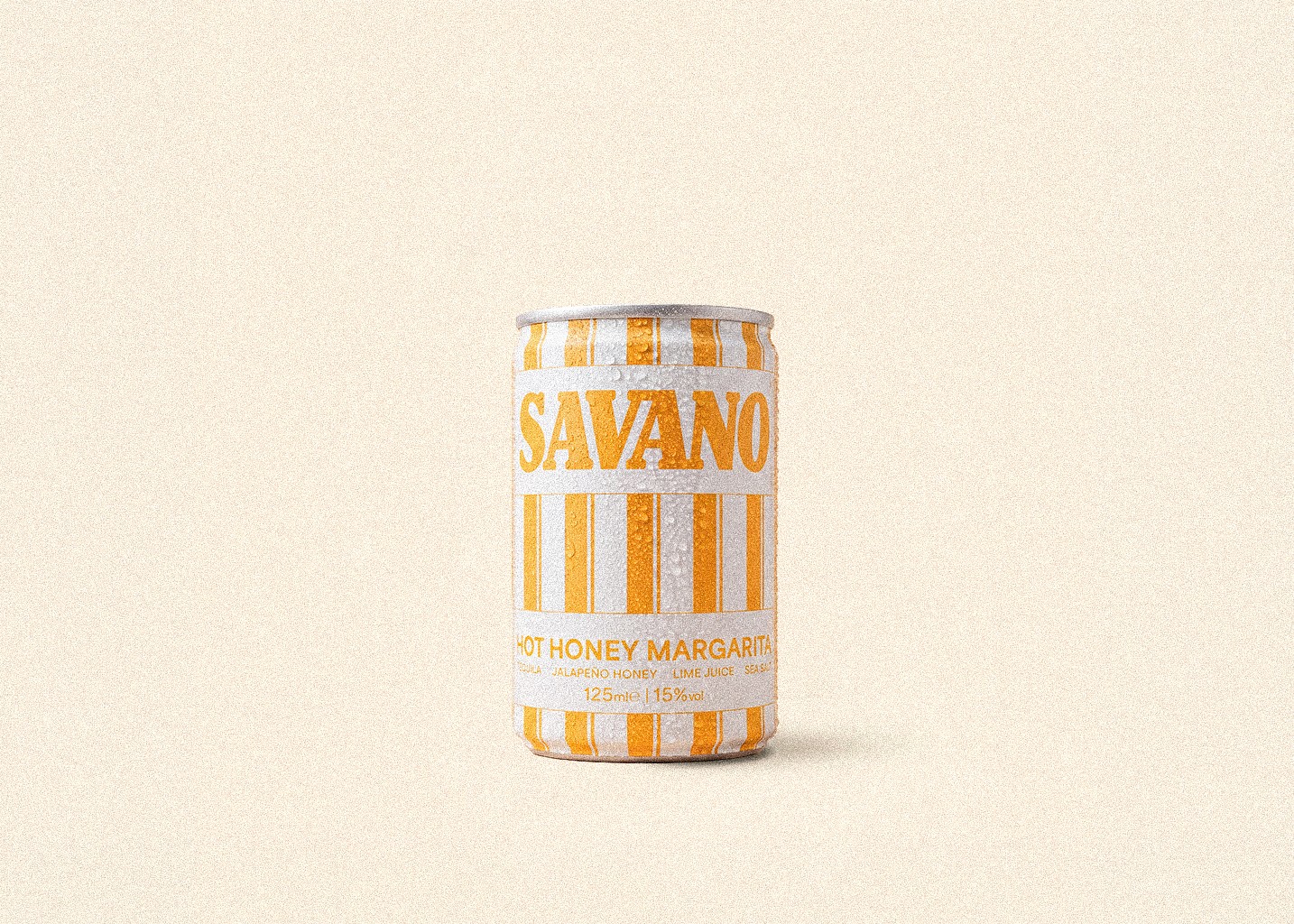
One of the primary objectives was to ensure the cans became the focal point of the brand identity. Each cocktail was assigned a distinctive colour that reflected its individual flavour profile, using vibrant yet slightly desaturated hues that work cohesively across the range. The colours were deliberately softened to evoke the sun-washed character of the Mediterranean beach clubs that inspired the brand. To allow the cans to take visual precedence, these vibrant hues are balanced against a warm neutral base, creating a refined aesthetic akin to the era.
One of the primary objectives was to ensure the cans became the focal point of the brand identity. Each cocktail was assigned a distinctive colour that reflected its individual flavour profile, using vibrant yet slightly desaturated hues that work cohesively across the range. The colours were deliberately softened to evoke the sun-washed character of the Mediterranean beach clubs that inspired the brand. To allow the cans to take visual precedence, these vibrant hues are balanced against a warm neutral base, creating a refined aesthetic akin to the era.
(08)


(09)

PACKAGING (10)

(10)


(11)
Early campaign videos were shot using a late-1980s Hi8 Handycam to give the visual identity greater depth and character. We chose to shoot on analogue to create a nostalgic home-video aesthetic, giving the content an authentic, approachable quality that reflects the brand's core principles.
Early campaign videos were shot using a late-1980s Hi8 Handycam to give the visual identity greater depth and character. We chose to shoot on analogue to create a nostalgic home-video aesthetic, giving the content an authentic, approachable quality that reflects the brand's core principles.
(12)
(13)
(14)
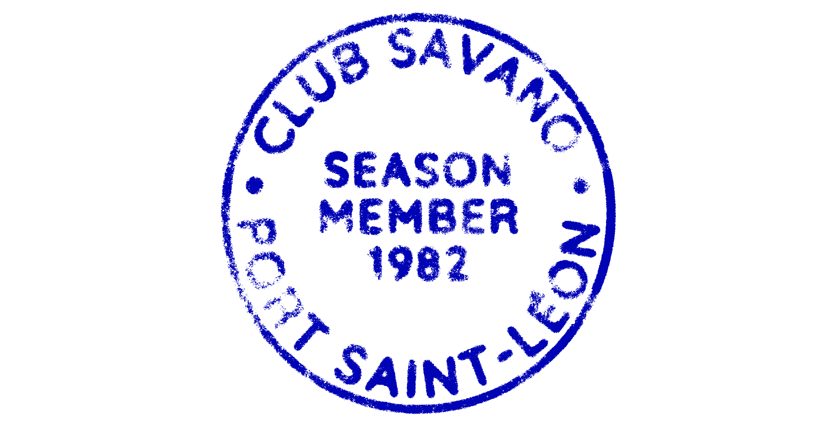
To build out the brand world, we created the fictional Club SavanO. our own little patch of the Riviera that became the foundation for the brand identity. It helped shape not just the visual aesthetic, but also the atmosphere and energy behind every creative decision, giving the brand a stronger sense of place and authenticity.
To build out the brand world, we created the fictional Club SavanO. our own little patch of the Riviera that became the foundation for the brand identity. It helped shape not just the visual aesthetic, but also the atmosphere and energy behind every creative decision, giving the brand a stronger sense of place and authenticity.
(15)


(16)
The primary typeface needed to be distinctive enough to carry the identity while reflecting the energy and expression at the heart of the brand. Originally designed in the late nineteenth century and reimagined in 1975, Bookman JF Pro became synonymous with the editorial and luxury lifestyle branding of the era. It brings warmth, character and sophistication to the identity without the formality of more traditional serif typefaces. Paired with Area Normal, its clean, geometric construction provides excellent legibility while creating a strong contrast with Bookman's softer, more expressive forms.
The primary typeface needed to be distinctive enough to carry the identity while reflecting the energy and expression at the heart of the brand. Originally designed in the late nineteenth century and reimagined in 1975, Bookman JF Pro became synonymous with the editorial and luxury lifestyle branding of the era. It brings warmth, character and sophistication to the identity without the formality of more traditional serif typefaces. Paired with Area Normal, its clean, geometric construction provides excellent legibility while creating a strong contrast with Bookman’s softer, more expressive forms.
(15)


(16)
SAVANO